The Login Page IS the Demo
GeekBye v1.7.5 added a product screenshot to the login page and deleted it the same day — rebuilding it as real components instead. Plus: the user who was faster than the OCR, and what 25 style commits in one day actually look like.
GeekBye v1.7.5 is a one-week release with a split personality: 37 commits, of which 28 are a login-page redesign — and 25 of those are style(login) micro-tweaks, all landed on a single day. It's also the release that fixed one of the most instructive races in the codebase. Both stories are worth telling, and they meet at the same idea: the login page is the first thing an unauthenticated user sees, so it had better be the product, not a picture of it.
A screenshot, for about five hours
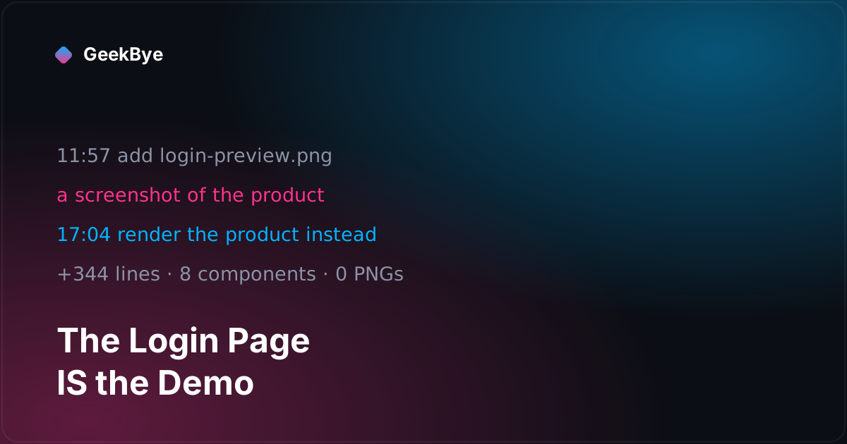
The redesign started conventionally. Restructure to two columns, put the sign-in on the left, and show the product on the right — as an image. The late-morning commits do exactly that: at 11:57 a real preview screenshot lands in the repo, a 114 KB PNG, and gets updated once six minutes later.
At 17:04 it was gone. The pivot commit replaces the static image with 344 lines of real components — a LoginDemo panel assembled from eight small pieces that replicate the actual overlay UI: the recording nav pill with its pulsing EQ bars and stop button, the chat panel with Chat/Transcript tabs, a rendered assistant answer (explaining React's useEffect, fittingly), the "Tell me more / Simplify / Show example" quick actions, the live-prompt row, and the ⌘⏎ Assist input.
Let's be precise about the word "demo," because it's easy to overclaim: the buttons have real hover states — glows, shimmers, transitions — but nothing is wired to click, and the input is read-only. It's not a sandbox. What it is, is the product's actual UI vocabulary rendered live: the same logo asset, the same gradient-border and backdrop-blur treatment, the same productName import the white-label system uses — so the demo rebrands itself automatically for each product built from this codebase. A screenshot can't do any of that. A screenshot is stale the day you take it, blurry on the wrong display, and permanently branded as whichever product you happened to capture. Components are crisp at any DPI, always current, and correct for every brand — because they aren't a picture of the design system, they are the design system.
The deleted PNG, incidentally, is still in the repo at the release tag — orphaned, referenced by nothing. Every codebase carries a few fossils of the approach that lost.
What 25 style commits in one day look like
The commit log of that single day is a designer's sketchbook, preserved with unusual honesty. The column ratio went 40/60, then 45/55. A "Works with" label above the platform logos was added at midday, repositioned, and removed — it lived about half a day. The platform-logo row itself (Google Meet, Teams, Zoom, Slack, Webex), added at 10:59 in the morning, was deleted entirely at 22:08 that night. And the footer took a four-approach saga to align: a single wrapper container, then removing the centering classes, then flexbox centering, then just nudging it closer to the bottom.
It would be easy to read that as churn. We read it as the actual shape of design work: you converge by rendering, looking, and adjusting — and doing that in 25 small commits instead of one squashed "redesign login page" means the search itself is recorded. When someone asks "didn't we try a logo row once?", the answer is in the history, with timestamps.
The user who was faster than the OCR
The release's engineering story happened five days earlier, in a three-commit fix chain. Since v1.5.12, pressing Cmd+H queues a screenshot with instant feedback: the thumbnail appears in the queue immediately, and the text extraction — local Apple Vision OCR, roughly one to two seconds — runs in the background. The queue event literally ships with ocrText: '' and a comment promising it will fill in later.
That's a good optimization, and it minted a race. A fast user presses Cmd+H and immediately submits their question. The screenshot's text field is still empty. The request goes out with no screen content, and the model answers — truthfully, infuriatingly — "I cannot see images." The naive path didn't fail with an error; it failed with a correct answer to the wrong question, which is the most confusing way software can fail. (A few releases later the whole premise changed: instead of racing to extract text, the app started sending the screenshot image straight to a vision model — see from OCR to pixels without losing the fallback, where "I cannot see images" stops being a possible answer.)
The fix gates the submit path on the async work the optimization deferred: if any queued screenshot still has empty OCR text, the request parks and the UI shows a "Reading screen..." indicator; a useEffect fires the moment the text lands and sends the request with the full extracted content. Two React-specific details in the diff are worth stealing: the screenshot queue is mirrored into a ref that's synced during render, because the event-handler closure chain was capturing stale state; and the parked request is sent directly rather than through the generic queued-request hook, for the same stale-closure reason.
And there's an honest wrinkle recorded right in the commit message: the tracing logs added to hunt this race revealed a second bug on the backend — the prompt assembly was dropping the screenshot text entirely in one code path. One symptom, two bugs, found by instrumenting the whole chain and watching where the text disappeared. The chain ended with a product decision, nine minutes after the race fix: Cmd+H queues screenshots for batch analysis, while Cmd+Enter always takes a fresh capture of the current screen — two distinct workflows instead of one ambiguous one. (What Cmd+Enter's Assist actually does is its own post: instant AI help on whatever you're looking at.)
One small coda from the same week, for readers of the white-label chapter: the Product/version (platform) User-Agent gained a dev-mode fix, because app.getVersion() in unpackaged Electron returns Electron's version, not the product's. Identity strings, as ever, leak in the plumbing.
Three things this release taught us
- Render the product, don't photograph it. A login-page demo built from real components auto-rebrands, survives every display density, and can't drift out of date. The screenshot approach was tried and deleted within a working day — cheap experiment, clear verdict.
- Every async optimization needs a gate at the point of use. "Instant feedback with empty OCR text" was the right UX call, but the submit path had to learn to wait for what the optimization deferred. If you defer work, find every consumer of its result and teach them the difference between "empty" and "not ready yet."
- Instrument the chain, not the suspect. The tracing logs followed the screenshot text end to end — shortcut handler to IPC to API client — and that's why one investigation closed two bugs, one of them on the other side of the network.
For the previous chapter in the v1 story, meetings you can actually find again (v1.7.3); for the next, four releases in twenty-six hours (v1.7.6–v1.8.1); and for the whole arc, the anatomy of shipping software to perfection.