Redesigning the Dashboard Around One Wave Chart
GeekBye v1.8.2 turned the dashboard from a recording remote control into a read-only analytics view — a stats strip and a 7-day wave chart. Both signature elements were second drafts, shipped within twenty minutes of their first drafts, in the same afternoon.
Some releases add a feature. GeekBye v1.8.2 mostly removed one — and the removal is the story. In a single afternoon in February 2026, eighteen commits turned the dashboard home from a recording remote control into a read-only analytics view: four stats and one activity chart. Along the way it shipped a bar chart that lived twenty-two minutes, a grid of stat cards that lived twenty, and a hand-rolled SVG wave that replaced both. The whole search is preserved in the commit timestamps, which is the best kind of design documentation there is.
The dashboard stopped being a remote control
Before this release, the dashboard home was a control panel. It led with a hero card — a big recording widget with a LIVE badge, Pause/Resume/Stop buttons, gradient blobs, and a useSessionState hook wiring it all to the recorder. The dashboard was trying to be two things at once: the place you look at your meetings and the place you drive the recorder. Two products, one screen, quietly competing.
v1.8.2 picked one. It deleted the hero card and the useSessionState wiring — including an effect that auto-navigated you to a meeting's detail page the moment a session ended, which is exactly the kind of "helpful" jump that surprises people mid-flow. Starting and hiding the recorder moved out to a plain navbar toggle (a repurposed button that lost about a hundred lines going from session controller to on/off switch), backed by a new navbar:hide IPC handler. What remained was a dashboard that does one thing: show you what you've recorded. Read-only. Calm.
There's a small, human bug in that transition worth calling out, because it's the sort of thing a redesign quietly introduces and a good eye catches the same hour. The two new sidebar buttons — Start and Hide — shipped with the same generic grid icon, so they were visually identical. Twelve minutes later a follow-up gave Start a play icon, gave Hide an eye-off icon, and tinted Hide amber, so "make the app go away" reads as a deliberate action rather than a neutral twin of "start." Icons are copy. Two buttons that look the same say the same thing, and these didn't mean the same thing.
The bar chart that lived twenty-two minutes
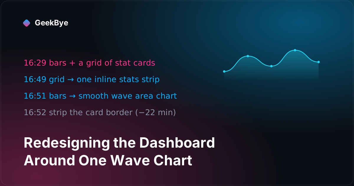
Here is the part I love, and it is entirely legible from the git log. At 16:29:34 the redesign's first draft landed: a 7-day activity chart drawn as bars — animated columns, a minimum height so tiny days stayed visible, a 2-pixel dim stub for zero days. Reasonable. Conventional. The kind of chart you reach for without thinking.
At 16:51:21 — twenty-two minutes later — it was deleted. The replacement commit says exactly what it did: "replace bar chart with smooth wave area chart for 7-day activity." And at 16:52:21, one minute after that, another commit stripped the rounded card and border from around the wave, "for cleaner look."
Why? The commits only say what changed, so the why is a reading — but the data shape makes it obvious. This is a tool where a typical user has zero, one, or two meetings on any given day. Seven bars, most of them 2 pixels tall, look like a mostly-empty parking lot. The same seven numbers drawn as a continuous filled area look like a trend — a gentle wave that rises where the week was busy. Nothing was faked; the y-values are identical. The redesign just chose the encoding that lets sparse, honest data read as a shape instead of as absence.
The stats got the same treatment on the same clock. The first draft (16:29) put four numbers in a 2×4 grid of cards. At 16:49 the grid collapsed into one inline stats strip — a single bordered row with hairline dividers, smaller type, one container instead of four. Five boxes on the screen (four cards plus a chart card) became two (a strip and a wave). The next PR added one more honest touch: the "Total Time" label became "Time in Meetings," because total-of-what was a fair question nobody should have to ask.
Twenty minutes, first draft to final, all inside one pull request. If those had been squashed into a single "redesign dashboard" commit, the search would be invisible. Because they weren't, you can watch a designer converge in real time.
The wave, mechanically
There is no charting library here. The wave is an inline SVG built in JSX, and it's worth a look because it's a small, honest recipe you can steal for any sparkline.
The smoothing is the trick. For each pair of adjacent points, the path uses a cubic-bezier segment whose two control points sit at the horizontal midpoint between them — cpx = (prev.x + curr.x) / 2 — with the control points held at each end's own height. That's the classic flat-tangent smoothing: the curve eases through every data point without ever overshooting above the highest or below the lowest value, which a naive Catmull-Rom spline would do. For a chart about meeting counts, "never draw a bump that implies a value that didn't happen" is not a nicety; it's correctness. The filled area is the same curve closed along the bottom and painted with a vertical gradient (cyan, fading from 30% to nearly nothing), and the line draws itself on with a framer-motion pathLength animation, left to right.
Under the SVG is the data plumbing, and it's the quiet hero. A new getAggregateStats() method on the transcript repository runs three prepared statements against the local SQLite transcript_sessions table: all-time totals (count, summed duration, average duration), a rolling seven-day count, and a per-day GROUP BY date(created_at) bucket. Then — and this is the detail that makes the chart robust — a small JavaScript loop walks the last seven calendar days and back-fills every day the query didn't return, pushing a zero. The chart is therefore guaranteed exactly seven points, always.
That guarantee is what makes the edge cases vanish instead of needing guards scattered through the view. An empty week? Seven zeros, and a Math.max(count, 1) on the denominator keeps the line flat at the bottom instead of dividing by zero. A single data point that would make the i / (n − 1) x-spacing formula produce NaN? Can't happen — the repository never emits fewer than seven. The weekday labels even parse each bucket at T12:00:00 rather than bare midnight, so a YYYY-MM-DD string doesn't slip to the previous day in a negative-UTC timezone. Fix the data's shape at the source and the rendering code gets to be naive on purpose.
All of it stays on the machine. The stats query reads the local database, returns through a typed transcript:get-stats IPC channel, and animates into four count-up numbers on mount. Nothing about your meeting history leaves the laptop to draw this chart — which, for a tool that records your conversations, is the only acceptable way to build an analytics view.
One more bug, because redesigns drag them into the light
Bundled into the same release was a fix that had nothing to do with the dashboard and everything to do with the kind of debt a redesign trips over. The app's dark scrollbar styling had drifted into two competing CSS definitions of the same class — an older purple one and a newer white-on-dark one — and which won depended on cascade order. Worse, only elements that remembered to add the class got styled at all; everything else fell back to the default light scrollbar, and horizontal scrollbars were never styled because the old rules set only a width, never a height. The fix deleted both definitions, styled the scrollbar globally on every element, and removed the now-dead class from the ten components that had been carrying it. It's a two-line diff repeated ten times — the unglamorous tax of having styled the same thing twice and letting both survive.
Three things this release taught us
- Subtract to focus. The dashboard got better by doing less — losing the recording controls it never needed and becoming one clear thing. A screen that is both a viewer and a remote is two half-products; pick one and move the other where it belongs.
- Choose the encoding your data deserves. Sparse counts read as absence in bars and as a trend in an area chart, from identical numbers. That's not spin — it's picking the honest shape that lets real, thin data communicate.
- Guarantee the data's shape upstream. The back-fill-to-seven loop is why the chart code has no scattered null checks: divide-by-zero, single-point NaN, and missing days all disappear because the query promises exactly seven buckets. Robust rendering starts one layer down.
For the previous chapter in the v1 story, four releases in twenty-six hours (v1.7.6–v1.8.1); for the next, shipping thirty languages without a safety net (v1.8.3); and for the whole arc, the anatomy of shipping software to perfection.